
Overview
Retail Media • Design System • B2B UI/UX Redesign
StoreBoost is a B2B retail media platform for dynamic digital out-of-home advertising. It lets brands, retailers, and media owners run location-targeted ad campaigns near physical stores.
As the only UI/UX designer, I managed product design across three web apps:
DSP Platform: Used for campaign planning and interactive map targeting.
Admin Platform: Used internally to manage media owners, screens, and permissions.
Client Portal: Used by advertisers to track campaign performance and footfall metrics.
The Problem
The product had accumulated visual and structural design debt over time:
No central design system: Engineers built screens independently. This caused inconsistent padding, mismatched fonts, and varied button styles across all three apps.
Complex map navigation: Users found it hard to filter ad panels, manage points of interest, and switch map layers smoothly.
Unclear reporting: Campaign performance lived in basic data tables. Advertisers could not easily see footfall gains or evaluate hourly impact.

Deliverables
Code-Aligned Design System: Built a Figma library with tokenised colours, typography, buttons, inputs, and cards that matched production code.
Interactive Map Interface: Redesigned the DSP map controls, panel cluster badges, and point of interest drawers.
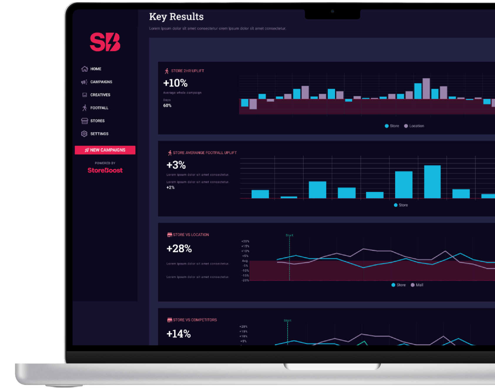
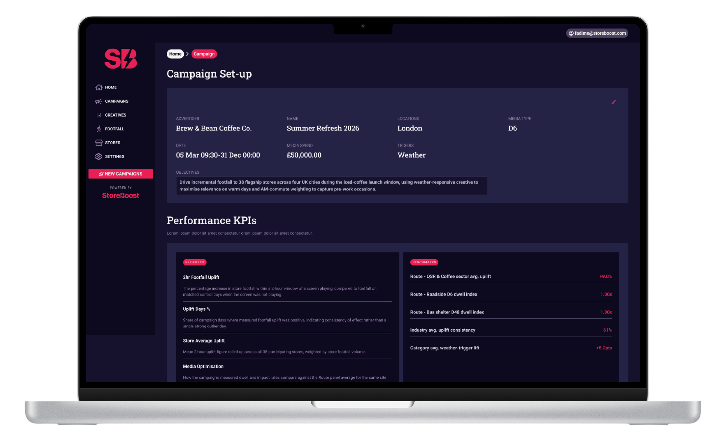
PCA Analytics Dashboard: Created a Post Campaign Analysis dashboard with footfall charts and benchmark trends.
Campaign & Trigger Views: Built campaign overview lists with status tags, budget summaries, and creative playout timelines.
My Role
As a UI/UX Designer, I led product design across the DSP platform, the internal Admin app, and the Client Portal.
Worked directly with product managers and engineers to shape product features.
Turned complex business rules into clean screen layouts.
Audited production SCSS files using AI tools to align Figma components with actual code.
Managed design work across all three web applications.
Research & User Needs
I spoke with internal account managers, operations teams, and campaign leads to understand their daily pain points:
Operations teams needed clear bulk controls in the admin app to manage screens and permissions quickly.
Campaign planners needed simple map layers to target specific store locations without distraction.
Brand managers needed visual reports to prove return on ad spend to their stakeholders.
User interviews showed that users spent too much time dealing with nested menus and hidden map controls. I also reviewed other B2B ad tools to see how they handled complex data visualisations and map filters
-Design System-
01
01
01
01
Read the code
Went file by file through the platform's SCSS in Cursor, pairing with AI to extract every colour, spacing value, radius, and font size actually in production.
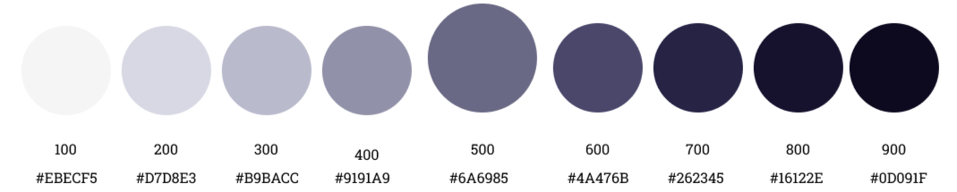
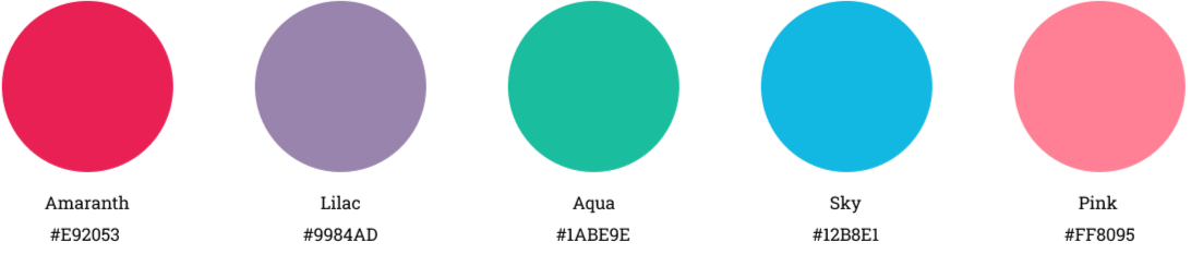
Colour Pallets
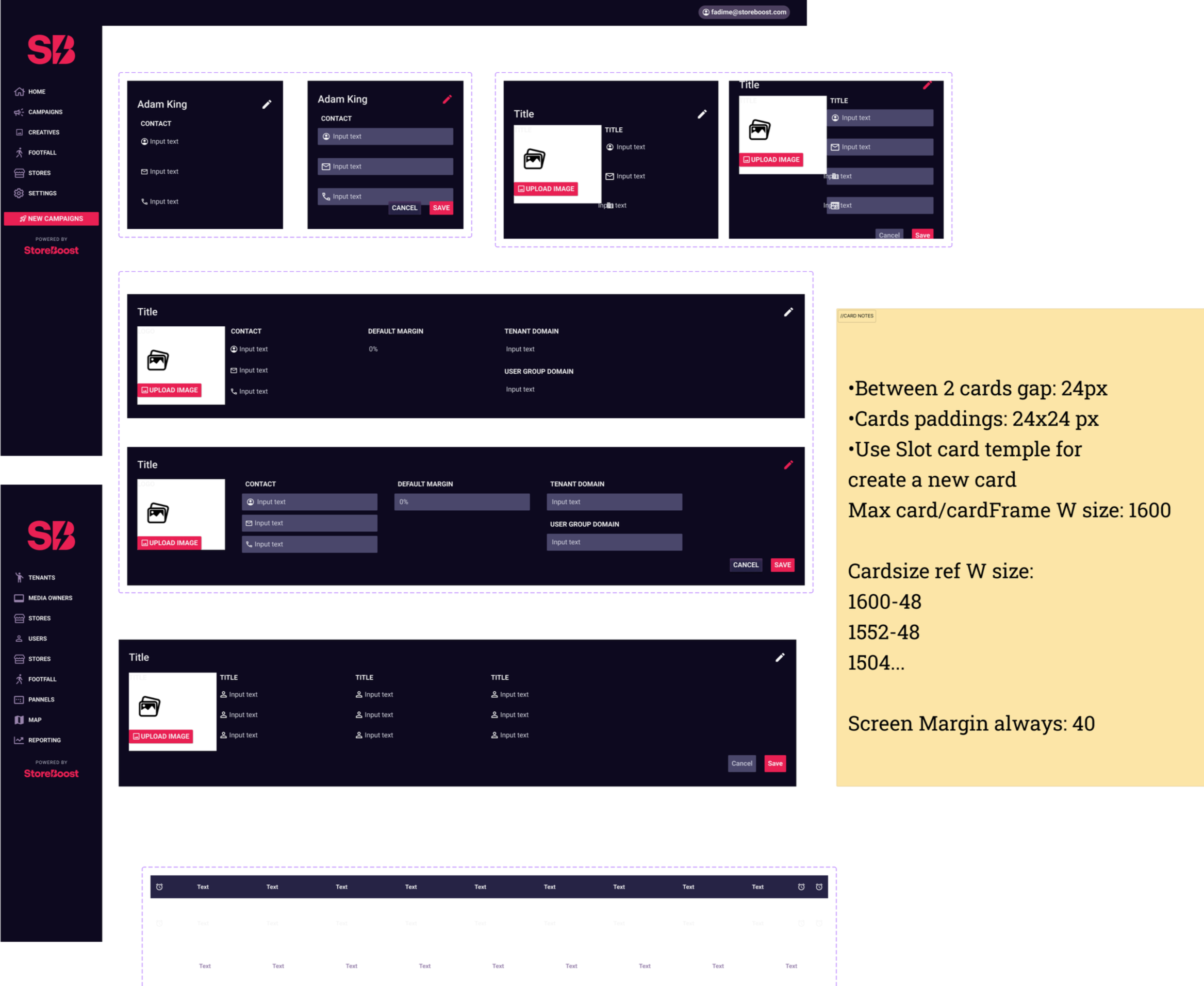
To bring consistency to all three platforms, I audited the production SCSS code using Cursor AI and set up matching Figma tokens:
Colour tokens: Grouped into surface, button, status, and chart pairs. This removed random hex codes.
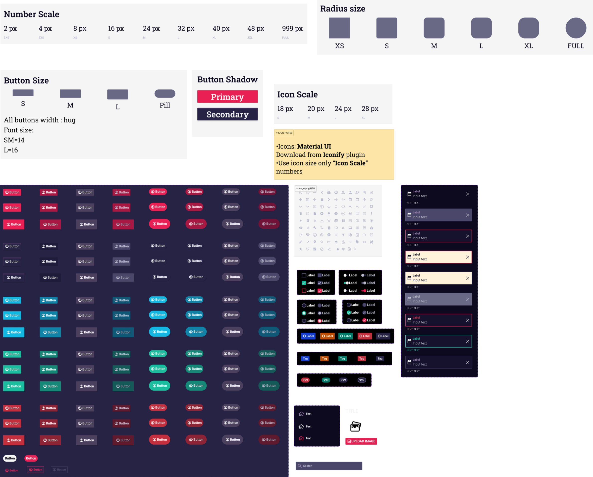
Button rules: Set clear scales for small, medium, and large buttons with fixed corner radius rules.
Card layouts: Created standard 24px padding and gap rules for card components.
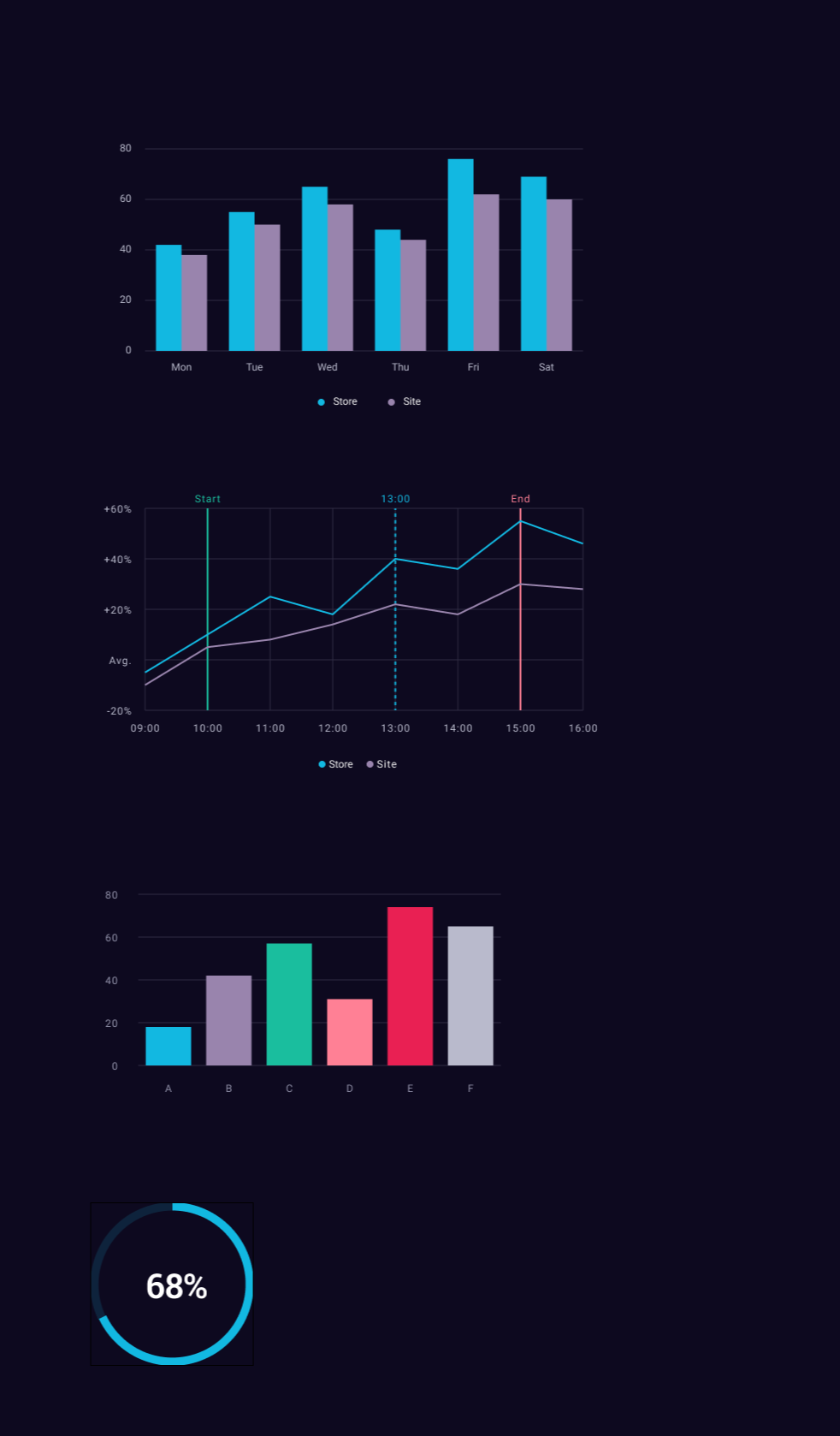
Chart styling: Defined clear colour pairs for comparisons and progress graphs to keep dark themes easy to read.
Primary
02
Name the tokens
Turned raw hex values like #E92053 into a real naming system primary/default, surface/BG, status/success-text
03
Rebuild in Figma
Recreated the tokens as Figma variables and styles, then built components directly. on top of them.
Charts & graphs
04
Document the rules
Added usage notes next to each component so the team could self-serve instead of asking me screen by screen.
Buttons & Cards
Secondary

Neutral
Key Design Solutions



Interactive Map Redesign
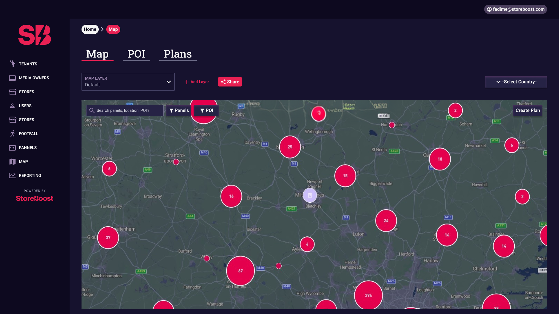
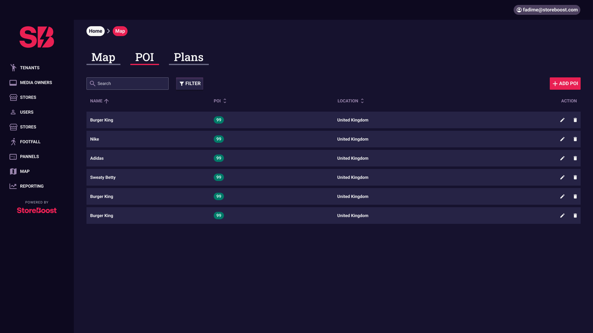
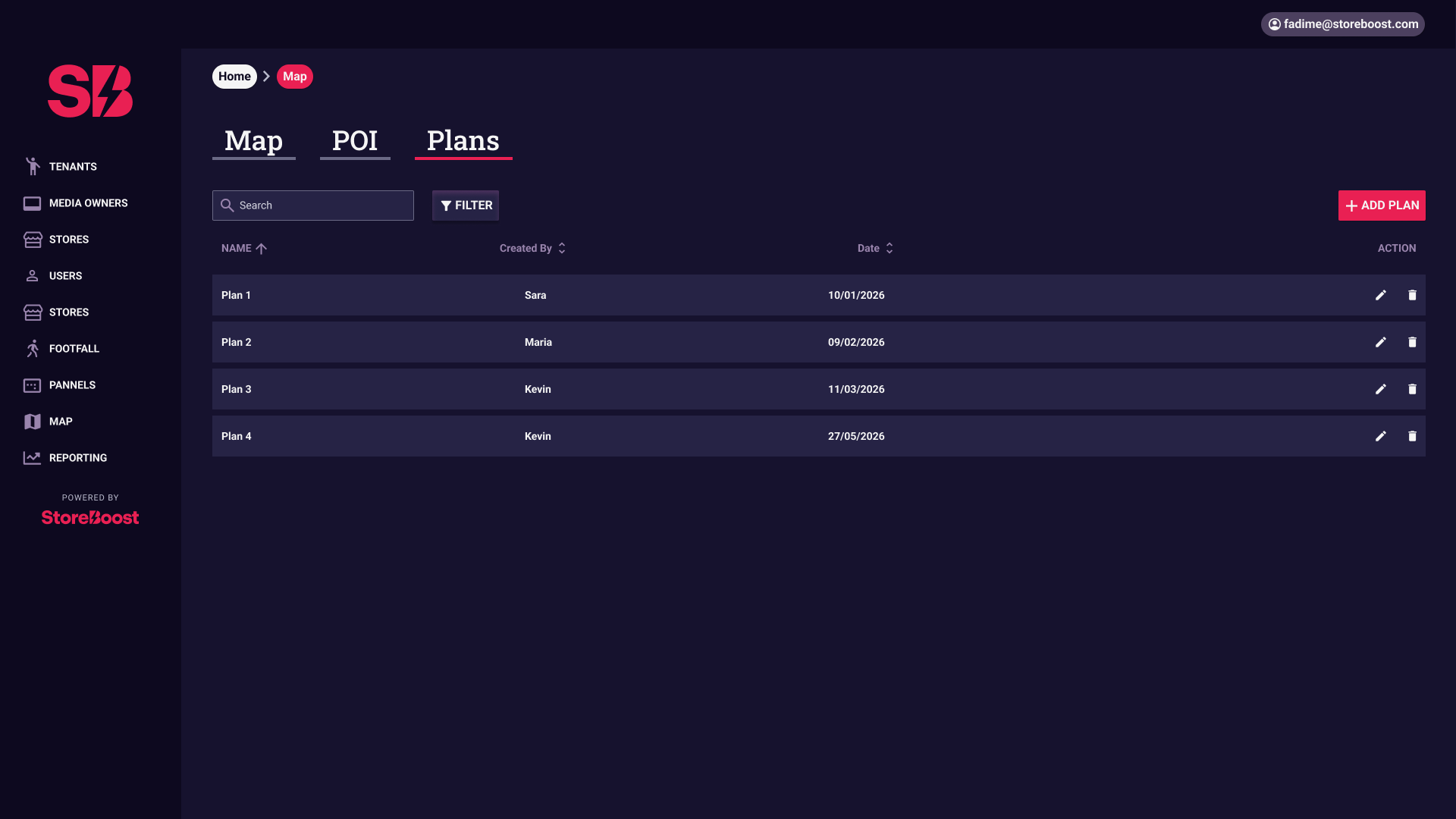
Added clear tabs for Map, Points of Interest (POI) and Plans.
Designed high-contrast cluster badges with exact panel counts on a dark base map.
Added quick-action buttons for adding layers, sharing plans, and toggling location filters.
Campaign Management & Triggers
Built a clear campaign listing page with status tags such as Completed, Paused, and Draft.
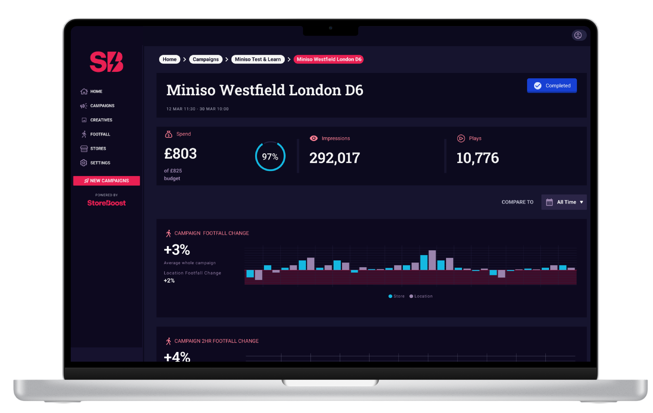
Designed a strategy detail view showing budget spent, total impressions, and play counts.
Added creative playout timelines to display video previews alongside weather and footfall triggers.


PCA Dashboard
Built a brand-new analytics dashboard to convert raw footfall data into clear visuals.
Added a 2-hour footfall uplift chart to show immediate visitor spikes after ad playouts.
Created comparison charts to show store footfall against shopping centre averages and competitors.
A live product with no shared design language
StoreBoost is a platform tenants, retailers and media owners use to launch in-store campaigns, manage stores, and track footfall performance. It had been in production for a while, which meant the usual story: every screen had been built by a different developer, at a different time, each with their own idea of what a “button” or a “card” should look like.
What that actually cost the product:
No single source of truth for spacing, colour, or components the product felt inconsistent screen to screen.
Every new feature re-opened decisions that should already have been settled
A few specific flows, most visibly the store map filters, had grown complicated enough that they worked against users instead of for them
How I approach a product that already exists
Before I redesigned a single screen, I needed to understand what was already true about this product not what a style guide claimed, but what the code actually did. That instinct shaped everything else on this project.
01
01
01
Audit before you invent
When a product already exists, the fastest path to a system people actually adopt is finding the decisions already buried in the code not proposing new ones from a moodboard.
02
Systems over screens
I don't ship one off components. Every button, card, and colour I touch gets backed by a token, so the next screen inherits the decision instead of re-making it.
03
Chase friction, not headcount
A small flow used constantly beats a big feature used rarely.
I look for where users are fighting the interface, not just where a page is missing.
04
Build for handoff
A design system only works if the team can self-serve without me. I write the usage rules as I build the components, not after.
Three zoom levels, one product
I worked across the platform rather than on a single feature, which meant constantly switching between zoomed-out systems thinking and zoomed-in interaction detail.
Rebuilding key flows
Redesigned the filtering experience on the Tenant platform's Map view, and designed the platform's comparative performance reporting end to end, from a blank canvas.
Platform-wide UI clean-up
Rebuilt inconsistent buttons, cards, forms, tags, and empty states across the product, module by module, screen by screen.
A design system, built from the ground up
The bigger, quieter piece of work: there was no design system for a live product that badly needed one. I reverse-engineered the platform's existing SCSS reading it file by file with an AI pairing tool (Cursor) to pull out the real colours, spacing, radii, and type scale already in production and turned that into structured Figma styles, variables, and components the whole team could build from.
Selected work: Two flows, rebuilt
The platform is large, so here are the two pieces I can walk through in the most detail.
Map filters that got out of the way
The Tenant platform's Map view let users filter stores by tenant, media owner, footfall band, and status but every filter lived at the same visual level, with no grouping or hierarchy. Users had to scan the same long list every time, whether they wanted a quick toggle or a precise multi-condition search.
Grouped filters by what they actually control location, performance, status instead of listing them alphabetically
Separated “quick” single-tap filters from advanced, multi-condition ones, so the common case stayed fast
Added a persistent summary of active filters with one-tap clear, so state was always visible
Designing the PCA page from a blank canvas
PCA the platform's comparative campaign-performance view didn't exist yet. There was no legacy layout to fix, just a stakeholder need: let media owners see how a campaign performed against a baseline, at a glance, then let them dig in.
Led with one comparison chart (store vs. site performance) instead of a wall of numbers
Used the new chart tokens from the design system, so “store” vs. “site” meant the same colours everywhere in the product
Built in start/end markers and hourly detail, so time-bound campaigns could be read at both a summary and a detailed level
Layered in benchmarks and competitor comparisons, so a number is never shown without something to judge it against
What this project actually taught me?
Design systems aren't invented, they're excavated
When a product already exists, the fastest path to a system people will actually adopt is finding the decisions already buried in the code, not proposing new ones from a moodboard.
AI pairing changes what “design ops” work looks like
Reading an entire SCSS codebase by hand to extract every token would have taken weeks. Working through it file by file in Cursor turned it into a project I could realistically finish.
Small flows carry disproportionate frustration
The map filters were a small part of the product by screen count, but they were touched constantly fixing them changed how the whole platform felt to use, far more than a single new page could.

Where this goes next?
Roll the design system out to the remaining legacy screens still built off the old, undocumented styles.
Pair with engineering to turn the Figma variables into shared SCSS/design tokens closing the loop in the other direction.
Other projects


Follow me on social


Get in touch
Interested in working together? Fill out some info and I will be in touch shortly. I can’t wait to hear from you!