Enough Store
•
Enough Store •
Overview and Problem Definition
The Enough Stores project is a London-based social enterprise tackling the critical gap between food waste and food insecurity in the UK.
Data-Driven Problem Statement
While over £1 billion worth of edible food is wasted annually and over 9 million people face food poverty, our local research showed a specific pain point: 65% of low-income families struggle to consistently access fresh, nutritious produce. The existing solutions lack dignity and flexibility.
The Solution:
We designed a dual-solution model: a physical store (container shops offering surplus food) and a digital app (featuring smart recipes, stock alerts, and nutritional scores) to create an accessible, dignified, and sustainable food model.
Hypothesised Success Metrics (Predicted Impact):
As the project is not yet live, the design decisions were directly tied to these prioritized Product goals:
Access Frequency: To increase the weekly fresh produce shopping frequency of target users by 25%.
Feature Adoption: To achieve a 30% adoption rate for the Smart Recipes feature within the first three months of launch (indirectly tackling household food waste).
Qualitative Metric (Dignity): To ensure users rate their overall shopping experience as 'respectful and dignified' with a score of 8.5/10 or higher in post-test surveys.
Deliverables
User research findings and interview notes
Personas and empathy maps
Experience map outlining key user journeys
Competitor analysis summary
Low-fidelity wireframes
High-fidelity UI designs
Interactive Figma prototype
Usability testing insights and improvements
Core design system elements (colours, typography, components)

My Role
I served as the UX/UI Designer for the Enough project, focusing on the end-to-end digital experience. My involvement extended beyond the visual interface:
Strategic Discovery: I managed qualitative research to define key user segments and map out their core challenges and pain points.
Defining the Solution Space: I translated research insights into actionable product features, prioritising the highest-impact solutions to meet our defined target metrics.
Design & Validation: I created the high-fidelity UI designs and validated the core hypotheses through usability testing (N=10 participants), ensuring the design was intuitive and met the users' emotional needs.
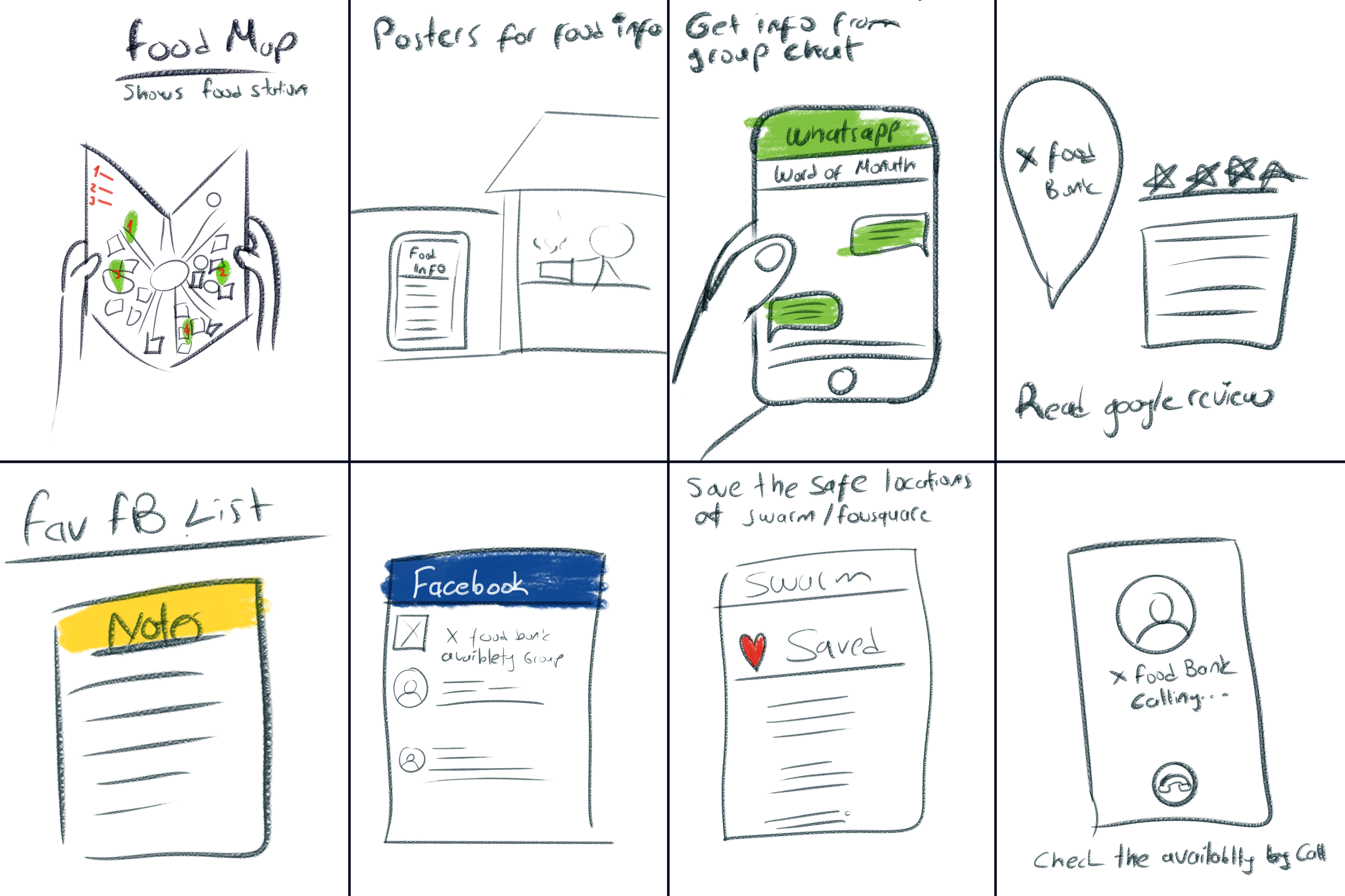
Methodology: In-Depth Qualitative Study
To ensure the solution was truly effective and addressed both functional and emotional barriers, I employed the Double Diamond framework, heavily utilizing Qualitative Research Methods:
Research Methodology & Key User Segment

User & Stakeholder Interviews:
I conducted 25 semi-structured, in-depth interviews with food bank users, volunteers, and middle-income individuals. This method was crucial for uncovering the human stories and behavioral patterns behind the quantitative data.
Thematic Analysis:
I analysed the interview transcripts to identify core themes, which led to the key finding that users desire nutrition education and dignity alongside affordability.
Quick, low-ingredient meal suggestions.


Recipe suggestions based on ingredients users already have.
Affordable, high-nutrition surplus products.
Simple map view and instant alerts for the nearest Enough Store.
Key User Segment
Based on the analysis, the project defined its primary focus as Working Parents on a Tight Budget. We found this segment, represented by the example Maria, lacked the time for healthy meal planning and the budget for consistent fresh produce. By shifting focus from detailed 'Persona' profiles to a clear 'User Segment,' we ensured the design remained focused on scalable business needs.
Persona

Name: Maria
Age: 42
Occupation: Pub worker, receives Universal Credit
Location: East London
Family: Single mum with a son
Pain Points
Lacks knowledge and time for healthy meal planning
Fresh produce feels expensive & time-consuming to prepare
Food banks often provide limited, unhealthy options
Goals & Motivations
Provide healthy meals consistently for herself and her son
Be more organised with meal planning & budgeting
Spend more quality time with her son instead of stressing about money and food
How We Can Help
Affordable, accessible food through a simple platform
Reduce time & effort spent searching for healthy options
Support with meal planning and budgeting
Ideation

Solution
Physical Store – The Enough Store
Shipping-container-based retail space.
Provides affordable surplus food.
Located in urban areas, accessible to families.
Mobile App Features
Smart Recipes: Suggests meals based on ingredients users already have.
Collaborative Shopping List:
From any recipe, missing items can be added to a list.
Lists can be shared with others, who can also add or remove items.
Shop Section:
Browse and select products directly from the app.
Pay in-store and collect at a pre-selected Enough Store.
Overall Impact
Makes access to fresh, healthy food affordable.
Saves time and effort, making it convenient.
Restores dignity by providing a respectful and supportive shopping experience.

-Design System-
I built the design system starting from the client’s existing logo to create a cohesive visual identity. Since the app serves a wide and diverse user group, I focused on intuitive and accessible design choices.
Using the logo’s main tones, I developed a clear and friendly color palette that enhances readability and visual balance. To maintain consistency and a modern look, I used the Lora typeface across the app chosen for its elegant yet highly legible form.
The overall design emphasizes simplicity, clarity, and inclusivity, ensuring that users of all ages can navigate the app effortlessly.
Typography
Header & Body Lora

Colour Palate
Primary Colours


Secondary Colours
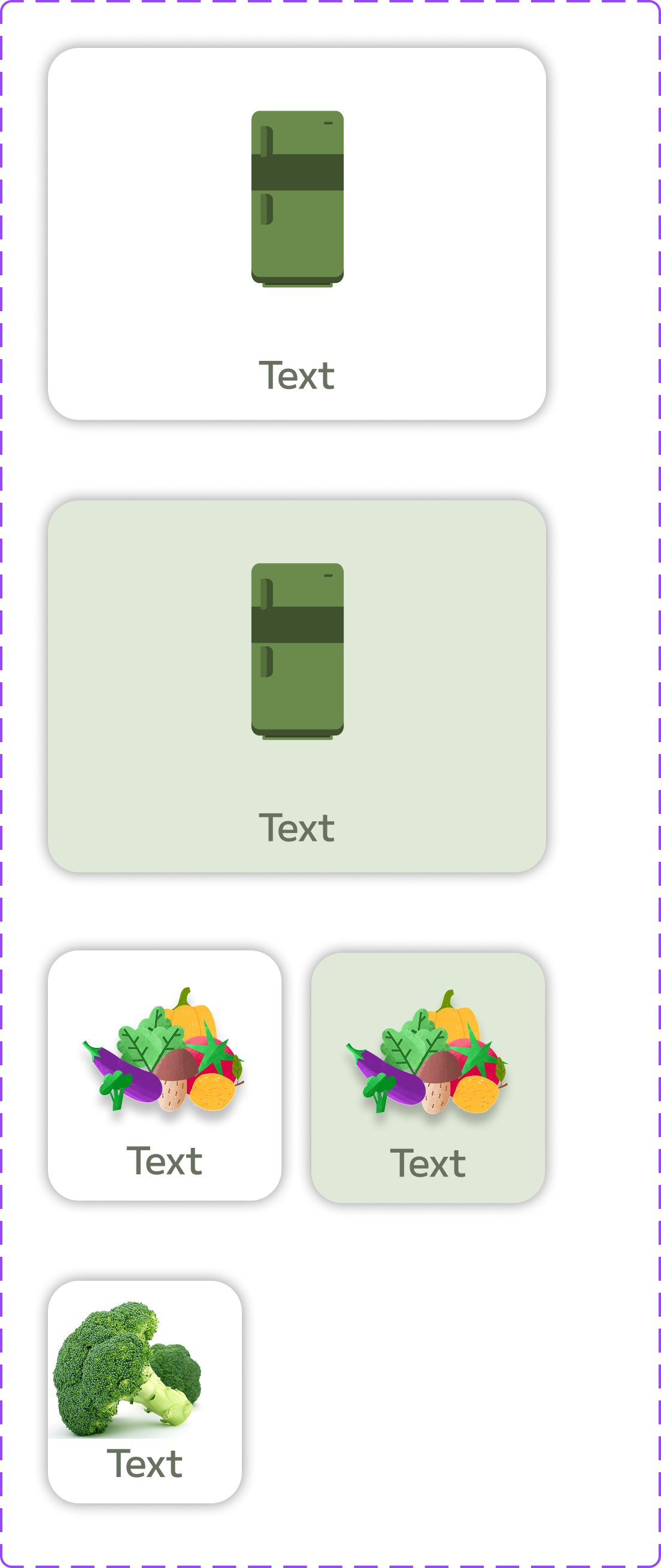
Icons & Components

Result

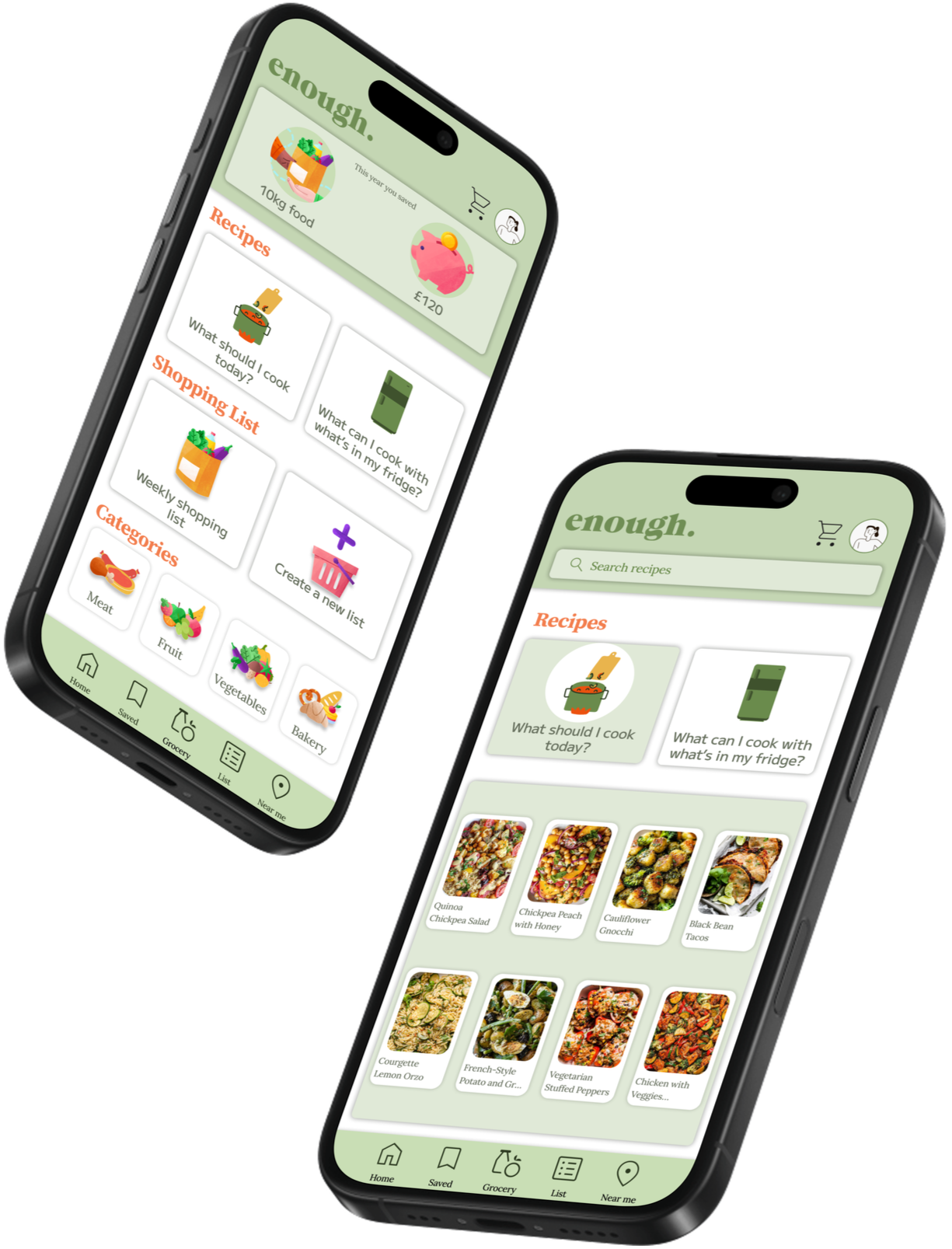
Login
Dashboard

At the top of the dashboard, users see the total food saved (kg) and money saved over the year. The main body is divided into three sections: recipes, shopping lists, and food categories. At the bottom, the app’s menu provides easy navigation.

Grocery
Checkout

Users can view real-time stock from their chosen Enough Store location and purchase needed items through the grocery section.
After checkout, users collect their pre-purchased items from their chosen Enough Store using a reference number.

Order Pickup
Smart Recipes
Recipes


Suggests meals based on the ingredients users select or exclude.
Offers quick meal suggestions to answer “What should I cook today?”.
Recipe Details
Shopping List


When tapping on a recipe, users can view the cooking steps and add all required ingredients to their shopping list with one click.
Items can be added to or removed from these shopping lists.

Near Location
The user selects the nearest Enough store and completes their shopping.
Learnings & Reflection
Reflecting on the "Enough Stores" project provided crucial insights into designing for high-impact social initiatives, especially when balancing business viability and emotional user needs.
Key Learning: Dignity Drives Engagement: We initially focused heavily on affordability. However, user testing confirmed that the emotional element of dignity (feeling respected and normal while shopping) was equally, if not more, critical for long-term engagement than the price point alone. This validated our decision to model the physical store after a standard retail environment.
Challenge: Technical Constraints vs. Ideal Flow: Integrating the existing inventory system with the new Smart Recipes feature posed a technical constraint. We had to simplify the initial recipe filtering criteria to ensure a smoother, more reliable user experience (UX) in the Minimal Viable Product (MVP).
Success: Data Translation: Successfully translating qualitative research (interviews about shame and time stress) into measurable, hypothesised metrics (like the "8.5/10 Dignity Score" target) was vital in grounding our design decisions in clear Product goals.
Next Steps & Future Scope
Should the project proceed to launch, the following strategic steps and future feature implementations would be prioritised to maximise impact and validate our initial assumptions:
Phase 1: Validation & Optimisation (Live Metrics Focus):
A/B Test: Run an A/B test on two different in-app Checkout Flows to measure which design yields the lowest drop-off rate, optimising the time-saving metric.
Primary Live Metrics: Closely monitor the live performance of Access Frequency (increase in weekly visits) and Smart Recipe Adoption Rate to confirm our design hypotheses.
Phase 2: Feature Expansion (V2.0):
Environmental Impact Score: Integrate a personalised user dashboard showing their contribution to reducing food waste and carbon emissions. This utilizes a gamification loop to promote sustainable behavior.
Personalised Budgeting Tool: Add a feature allowing users to set a weekly budget cap within the app, providing real-time alerts and suggestions tailored to their financial goals.
Other projects


Follow me on social

Get in touch
Interested in working together? Fill out some info and I will be in touch shortly. I can’t wait to hear from you!